CSS grid layout is two-dimensional grid system to CSS. It can be use to layout page or small user interface like cards, table, In this article you will learn more about grid layout and how to impliment grid layout.
More About Grid
A grid is a set of interseting box can either be square , rectengle or the combination of both, for more understanding below is the screenshot
After this you will be able to know how we can impliment some examples like cards grid css, css grid card,css grid carousel, css grid two coloumn , css grid three coloumn
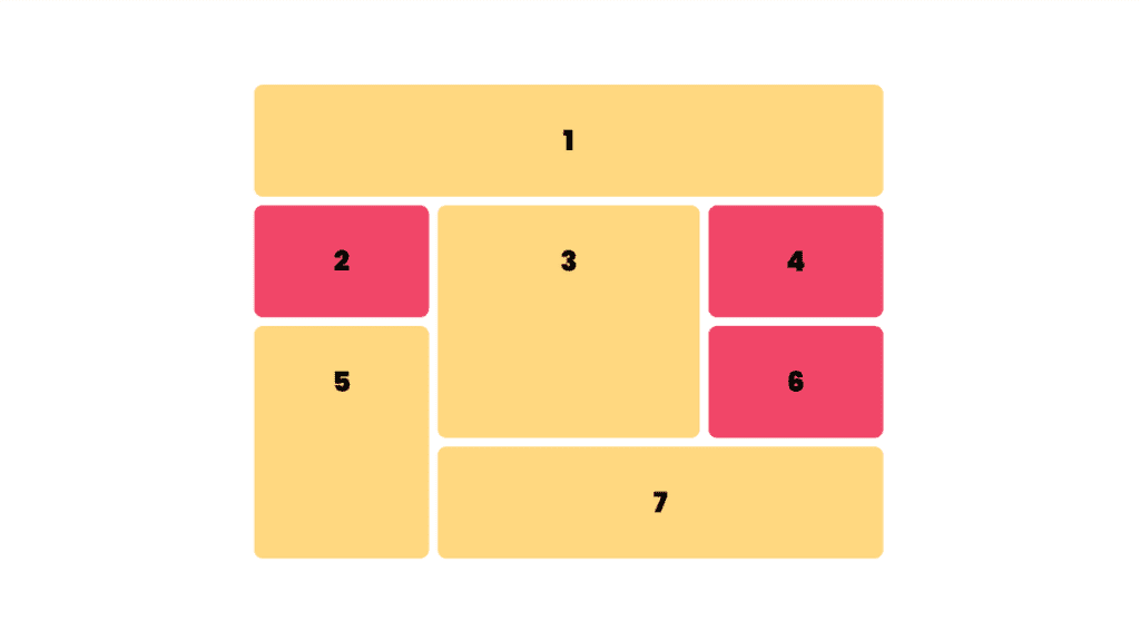
While Makeing grid Layout Grid size can be defined with pixels and % or with unit fr specially desinged for this purpose.
Grid Container
Grid Container can be created by display : grid or display: inline-grid on element . As we do this all the children element to this container only will alinged to grid. Below is the example
Small Grid Layout Example
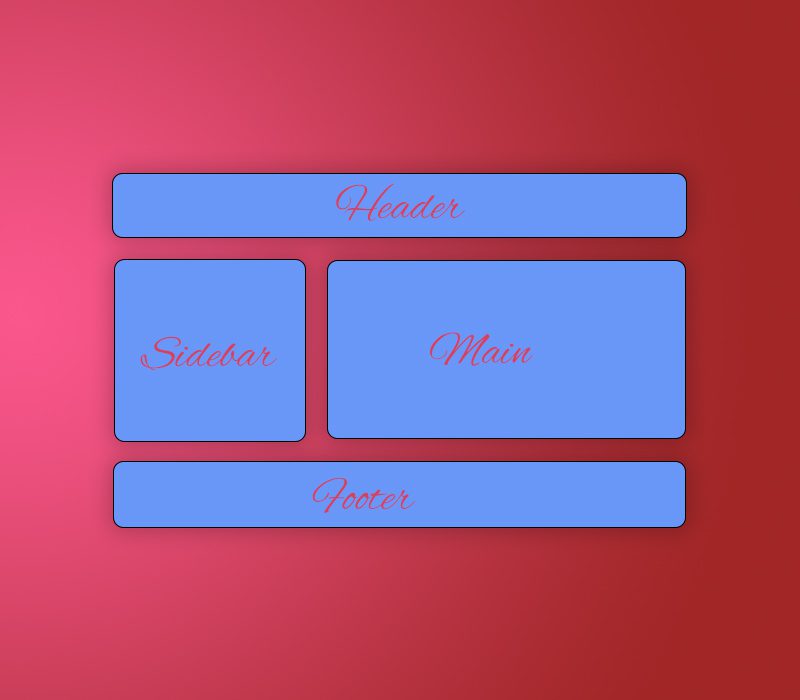
Lets Create a small example using grid layout which container Header, footer, main area left, main area right, below is the screnshot which we will achive through grid layout
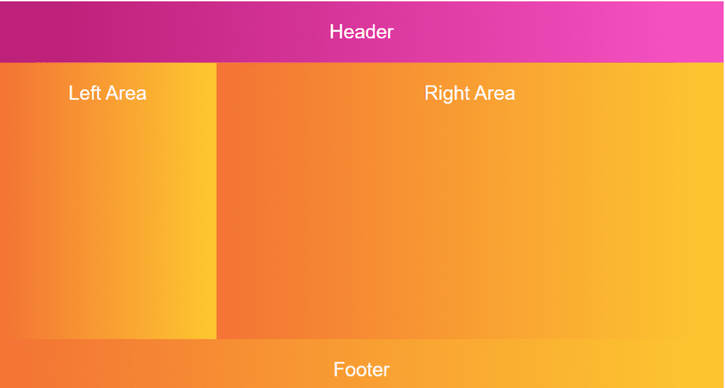
For the above screenshot we have created main container, in that main container we have added childrens divs with class .header, main-left, main-right, footer below is the HTML structure on above UI
 <div class="main-container">
        <div class="header">
            <p>Header</p>
        </div>
        <div class="main-left"><p>Left Area</p></div>
        <div class="main-right"><p>Right Area</p></div>
        <div class="footer"><p>Footer</p></div>
    </div>
We have main container in which we have added style as display:grid Please check the below styles
.main-container {
        display: grid;
        width: 100%;
}
With of the container is as per your requirement i have given it 100% because iam looking for fluid layout
Now we have to create Header footer, main area left and main area right and inside the we need to provide a name space sp we can use that in main container and the name space is given by a key grid-area: please follow the below code.
.header {
  grid-area: header;

}
.footer {
  grid-area: footer;

}
.main-left {
  grid-area: main-left;

}
.main-right {
  grid-area: main-right;

}
Now we have to use these name spaces in main container as a pattern as screen below to achive above screenshot layout.
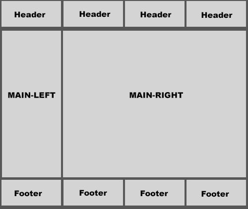
So the above layout in simple text whould be divided in 4 coulumn as container for top header it have 4 coulumn with all header in next row it has one main-left column and then three of main right column in next row it container all 4 column of footer.
"header header header header"
"main-left main-right main-right main-right"
"footer footer footer footer";
An now the final css of main container whould be as below
    .main-container {
        display: grid;
       width: 100%;

   grid-template-areas:
		"header header header header"
		"main-left main-right	main-right main-right"
		"footer footer footer footer";
    }
We have written proper html and css to achive above desing demo is as below
Header
Left Area
Right Area
Download Final Code Below
Some More Basic Example of Grid Layout
Let go with a simple example to setup divs in equal grid, and to make them fluid will learn more about FR UNIT
The Fr Unit
Tracks can be defined using any length unit. Grid also introduces an additional length unit to help us create flexible grid tracks. The new fr unit represents a fraction of the available space in the grid container. The next grid definition would create three equal width tracks that grow and shrink according to the available space.
Lets Start With a simple grid layout , for that we need to create a div in that we will impliment some cards
<div class="cards">

          <div class="card">

            <h3>Card Title</h3>
            <div class="user-data">
              <p>
                In publishing and graphic design, Lorem ipsum is a placeholder
                text commonly used to demonstrate the visual form of a document or
                a typeface without relying on meaningful
              </p>
            </div>
          </div>
          <div class="card">

            <h3>Card Title</h3>
            <div class="user-data">
              <p>
                In publishing and graphic design, Lorem ipsum is a placeholder
                text commonly used to demonstrate the visual form of a document or
                a typeface without relying on meaningful
              </p>
            </div>
          </div>
          <div class="card">

            <h3>Card Title</h3>
            <div class="user-data">
              <p>
                In publishing and graphic design, Lorem ipsum is a placeholder
                text commonly used to demonstrate the visual form of a document or
                a typeface without relying on meaningful
              </p>
            </div>
          </div>
          <div class="card">

            <h3>Card Title</h3>
            <div class="user-data">
              <p>
                In publishing and graphic design, Lorem ipsum is a placeholder
                text commonly used to demonstrate the visual form of a document or
                a typeface without relying on meaningful
              </p>
            </div>
          </div>
          <div class="card">

            <h3>Card Title</h3>
            <div class="user-data">
              <p>
                In publishing and graphic design, Lorem ipsum is a placeholder
                text commonly used to demonstrate the visual form of a document or
                a typeface without relying on meaningful
              </p>
            </div>
          </div>
          <div class="card">

            <h3>Card Title</h3>
            <div class="user-data">
              <p>
                In publishing and graphic design, Lorem ipsum is a placeholder
                text commonly used to demonstrate the visual form of a document or
                a typeface without relying on meaningful
              </p>
            </div>
          </div>

      </div>
We have added 8 cards in the html and we will display them ad a grid, so its some kind of requirment like fetching the user API and display multiple data in cards, above is the HTML structure and below is the css code for that
.grid-layout-two .cards {
    display: grid;
    grid-template-columns: 1fr 1fr 1fr;

   gap: 20px 10px;
}
.grid-layout-two .card {
    border: 1px #ccc solid;
    padding: 10px;
    border-radius: 10px;
    font-family: Arial, Helvetica, sans-serif;
    background-image: linear-gradient(to top, #30cfd0 0%, #330867 100%);
}
.grid-layout-two .card p {
    margin: 0;
    font-size: 18px;
    line-height: 24px;
    color: #ffffff;
}
.grid-layout-two .card h3 {
    color: #ffffff;
}
And the preview of above code is as below
Card Title
In publishing and graphic design, Lorem ipsum is a placeholder text commonly used to demonstrate the visual form of a document or a typeface without relying on meaningful
Card Title
In publishing and graphic design, Lorem ipsum is a placeholder text commonly used to demonstrate the visual form of a document or a typeface without relying on meaningful
Card Title
In publishing and graphic design, Lorem ipsum is a placeholder text commonly used to demonstrate the visual form of a document or a typeface without relying on meaningful
Card Title
In publishing and graphic design, Lorem ipsum is a placeholder text commonly used to demonstrate the visual form of a document or a typeface without relying on meaningful
Card Title
In publishing and graphic design, Lorem ipsum is a placeholder text commonly used to demonstrate the visual form of a document or a typeface without relying on meaningful
Card Title
In publishing and graphic design, Lorem ipsum is a placeholder text commonly used to demonstrate the visual form of a document or a typeface without relying on meaningful
So in main continer css we have added display as grid (display:grid) and if you want to display 3 box in a rox then we will add grid-template-columns: 1fr 1fr 1fr; and gap as gap: 20px 10px; 20px from top and 10 px from left and right
Below is the code
.grid-layout-two .cards {
    display: grid;
    grid-template-columns: 1fr 1fr 1fr;
    gap: 20px 10px;
}
This is all main about the grid layout , so if you want to leanr more about grid layout please follow the below link
https://developer.mozilla.org/en-US/docs/Web/CSS/CSS_grid_layout/Basic_concepts_of_grid_layout

